Render-ready material base settings
In this document we provide base settings for the following materials:
Chrome
We will start with chrome, one of the easiest materials to configure. First of all create a new material with a black or very dark grey base color and apply this to your surface(s). Call this chrome.
Open the Podium material editor, then with SketchUp’s eyedropper (ctrl click the paint bucket) select the surface with the new material. In the Podium materials editor, you should see the material name displayed if you have selected it correctly. Set the diffuse slider to a low value , around 5% should be fine, and then move the reflection slider to make up the difference to 100%.
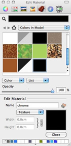
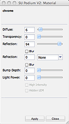
Note that Reflection is not set at 100%. This is because in reality, there is no such thing as a perfect mirror. The Diffuse component is what enables us to see the color of an object. It will work if you set reflection to 100%, but it is helpful to understand how surfaces behave in real life.
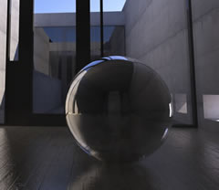
Note: Chrome acts as an alost perfect mirror, so a chrome surface is mostly going to reflect its environment. If your test render isn't turning out like the one shown above, it is probably because you are trying to render your chrome object with no environment around it. If you need test scenes to practice with, several test models can be downloaded here.
Plastic
When you look at most types of plastic, you will see that it is generally glossy. This is because the surface is fairly smooth and flat. However, unlike other smooth, flat surfaces, like wood or painted plaster, it does not have a completely matt finish. We will cover wood and painted walls another time.
In reality all materials reflect light, this is the diffuse component that you see in the materials dialog, and it determines our ability to see color. In Podium, if you want to make a surface shiny or glossy, you will need to move the reflection slider. For a glossy rather than shiny effect, you need to make sure the Blur box is checked.
Note that when you use blurred reflection, the blur tends to have the effect of reducing the reflectivity, so you may need to increase the reflectivity more than you would expect.
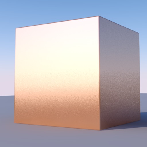
There are a number of different types of plastic, most of which tend to be glossy in varying degrees. Very shiny plastic is easy enough to simulate. Simply use the reflectivity slider. You should not need a value greater than 10, even values of 2 or 3 will produce a noticeable sheen depending upon the angle at which light hits it. The cube below simply has diffuse 98%, Transparency 0%, reflectivity 2%.
Slightly glossy plastic is a little more involved, but still straightforward. If you increase reflectivity to 20%, you will get a result like that below.
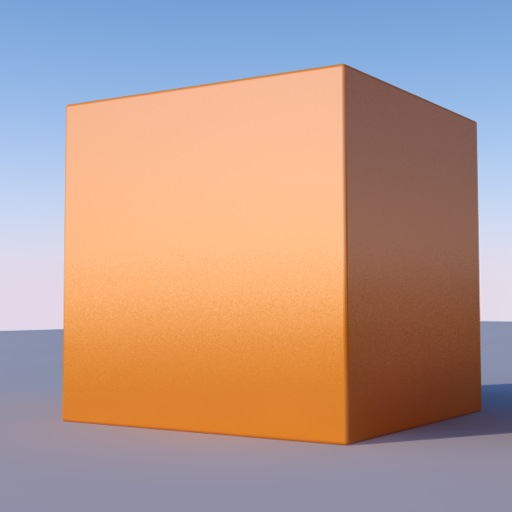
Be careful of setting reflectivity too high. It is not just a case of increasing reflectivity. The more your surface reflects the environment, the less prominent its color will be, because the surface is reflecting the environment. The image below shows what happens when you set reflectivity to 50%.
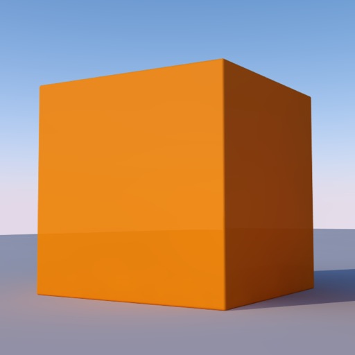
Notice that the glossiness is similar, but the color has changed as the cube is reflecting more of the sky. For an interior scene, the effect would be quite different as there are lots of other colours and the overall lighting level is likely to be lower. Do not be afraid to experiment, because depending on the conditions, you will need to adjust the settings to get the precise effect you want.
You will also notice a slight graininess to the blur. This is hard coded into the presets. The smoother the blur on the reflection, the longer it takes to render. The current setting is a good compromise between speed and quality. Blurred reflections will increase render time. From a distance, the graininess of the blur is not noticeable.
Many types of plastic, for example those used on a lot of computer equipment, is slightly textured. If you look at the archetypal computer case, keyboard, laptop power supply etc. you will notice a kind of glossy, textured surface. This is also not difficult to simulate in Podium. The image below shows the effects you can achieve. It takes a little more work, but it is not too complicated. For this, you will need am image editor. In Photoshop I used a simple noise filter which just created a random series of tiny dots, slightly darker than the main body color. The raw texture is shown below.

It still looks predominantly like a plain color but you can see the speckles. Use this instead of a plain color in SketchUp. The advantage of the texture with spots, is that Podium can use it to create a bump map. This is an effect which simulates a bumpy surface. Most render engines require you to load a separate bump map. This is usually a high contrast monochrome version of the actual texture. The render engine will analyse the dark areas in the bump map image and use this to simulate the effect of depth in the corresponding areas of the actual image texture.
Podium creates temporary bump maps during the render process, so you do not need to use separate images. This is not as flexible as using separate bumpmap images, but it is a lot quicker and easier to set up. The image below has material settings of D80/T0/R20 with a bump value of 8.
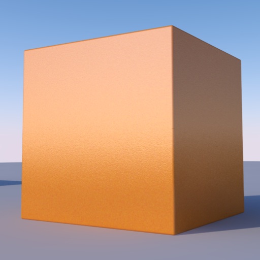
You can see the effect of the bump setting towards the lower half of the cube. A magnified section of this is shown below.
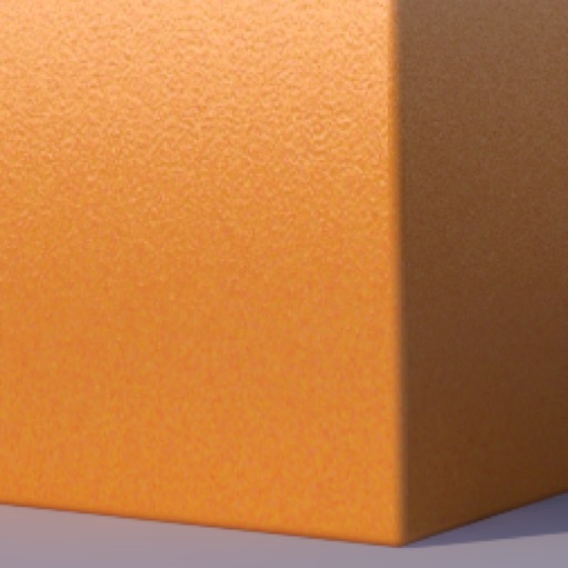
This orange peel effect is characteristic of textured glossy plastic. Notice that you ca not really see the speckles on the texture, because they have been transformed into a bumpy effect on the surface.Blurred reflection is the more common than the mirror (or environment) reflection you see in glass, water and chrome.
Using this adds a lot more realism to your scenes. Once you look around at your environment with a view to simulating it in a render, you will see blurred reflection on painted walls (satin effect paint for example), sealed wooden floors, and brushed metal. It is worth remembering that the effect needs to be used carefully and selectively, so as not to increase render time too much.
When you want to render a material, it is always best to try to look at it critically and understand its properties, then you will be able to simulate it more realistically.
Bump mapping basics
First, a little background.
Bump mapping and its variant ‘Normal mapping’ are techniques used by render engines to simulate bumpiness on a surface. Put simply, bump mapping is a 2d representation of a 3d surface, normal mapping is a more complex and accurate technique using greater colour depth to provide additional information about the 3 dimensional properties of a surface. Podium doesn’t support normal mapping at the moment, it is included only for the sake of completeness.
In simple terms bump mapping works by analysing a surface to determine the high and low points. Logically, the low points are the dark areas, and the high points are the lighter areas. The rendering algorithm then calculates the ‘surface normals’ which are points perpendicular to the plane the texture is on. Based on the angle of the normal relative to the camera, and the brightness of each point, the render engine adjusts the pixel brightness of each point on the surface to simulate how light would reflect off it, simulating actual bumpiness.
There are two ways that this bump mapping is implemented, either using the brightness values of the coloured pixels, or using a separate bump map. Most high end render engines require creation and use of individual bump maps, specific to each texture. Typically these are monochrome versions of the texture file that have to be loaded into the render engine for each texture. The contrast and exposure values determine the accuracy of the effect. There are some tools like CrazyBump which give a lot of control over the effects, but for most people (i.e. the non-professional render artist or designer), you won’t notice the effects of the subtlety that tools like this offer. You can waste a lot of time playing around for little discernable difference in your render. In keeping with Podium’s ethos of simplicity and productivity, the render engine creates its own bump maps on the fly. All you need to do is move the slider.
Examples of bump and normal maps are shown with the main texture map below.
Normal and Bump map versions either side of the diffuse texture.
When used properly, bump maps add realism to renders. They are best used for textures that are close to the camera, for surfaces that have clearly-defined dark and light areas.
The image below shows a textured surface without bump mapping. It has blurred reflection applied to give it a slight sheen.
The image below shows the benefit of bump mapping. I have used a value of 20, which is quite high. You can see more detail, and the raised areas look more realistic.
Bump mapping can be particularly effective when used with blurred reflection.
For surfaces like masonry brick and blockwork, you can also get a better sense of surface roughness. The image below shows the difference. What is noticeable is that the effect is not as pronounced as you might expect. This is because it depends on the amount of contrast in the main texture, and it’s resolution. The better your initial texture, the more noticeable the effect will be.
One of the best uses of bump mapping is for creating water using a flat plane.
Used with reflection and refraction, this can be remarkably effective, while keeping the polygon count down.
The Podium Browser has a fully configured water material in the ‘free’ section. It is configured as D5/T57/R38 with the refractive index set as water, or 1.33. Bump value is set at 5. You can increase this, depending on the texture map you use, but be careful of setting it too high, or you will get a ‘cast glass’ effect instead.
The above settings generally produce pretty good results as you can see from the image below. Setting the diffuse value at 5 just gives a slight colour tint to the water. Getting the balance between reflection and transparency can be tricky, and may need to be modified depending on the materials below the surface of the water, the angle of the sun and the texture used for the water.
Sometimes however, it is better not to use bump mapping at all. Although it is fairly quick, there is a definite speed penalty when it is used. Also, when viewed from a distance, bump mapping sometimes has unhelpful results.
The first scene below uses no bump mapping. Note the render time.
Okay, let’s do something about that wall and add some bump. We’ll start with a modest value of 8.
You can see a subtle bump effect on the right hand wall. You can’t see the effect as clearly on the other walls, because they are in full sun and there isn’t a lot of contrast in the original texture, which means that it isn’t that bumpy. So far so good, and render time seems to have decreased slightly. This is quite normal given what other processes may or may not be running in the background.
Let’s try and increase the bumpiness to 30 and see what that does.
Here you can see that the high bump value makes the wall look ‘grainy’. Not too realistic!
This is quite common as you can see in the following image.
You can clearly see the graininess on the floor plane caused by bump mapping. The thing to remember is that just because you can do something, doesn’t mean you should!
In summary, Podium’s bump mapping is really easy to apply, and can create some nice subtle effects. However, it needs to be used with care, and the values used depend on the lighting, texture scale, viewing angle and distance of the surface to the camera.
Future releases of Podium will allow loading individual bump maps for greater control over the results. For the moment though the process is automated. It is quick and easy to apply, but the trade off is lack of flexibility.
Translucent Glass
Translucency is the property where a material allows light to pass through it, but does not allow you to see any detail. You can see outlines where light is blocked from travelling though the surface, but little more than that.
What is happening here is that light entering the material and passing through it is being scattered, preventing any detail from being seen.
In some render engines, this can be tricky to configure. In Podium however, you just choose an index of refraction for your material, and check the 'blur' box. Just as with blurred reflections, there is nothing else to configure.
The image below shows the effects you get with D5/T95/R0 and refraction set as ‘glass’. I have used the new materials configuration scene here and you can clearly see the white outline of the base plane behind the cube.
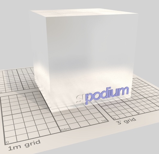
As you can see, this is quick, easy and realistic. We can get different effects by playing around adding reflection, blurred reflection, and textures.
The image below uses a texture map with a fine grain (Photoshop 256x256, mid grey, >Filter>Texture>Grain) to create a slight bump effect, similar to what you find with sand blasted or acid etched glass.
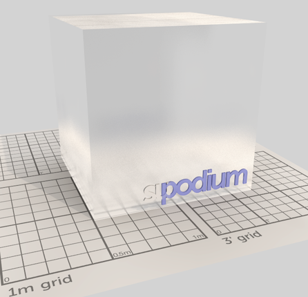
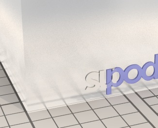
You see the sandblasted effect on the enlarged area below, along with the texture used to achieve it.

You can also get slightly different effects by altering the index of refraction. The image below uses IOR of 1.1.
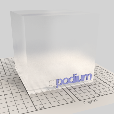
We can get more varied and subtle results using reflection as well, as you can see from the results below. In these images, Podium’s physical sky has been turned on to show the differences more clearly, which aren’t as evident with a plain grey background.
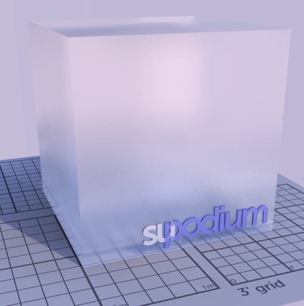
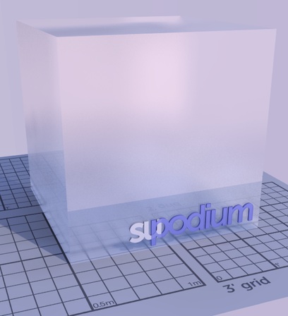
One important thing to note is that blurred refraction will increase render time, sometimes substantially, depending on the scene. If you have a complex scene it is best to test render speed before applying this property.
If you have purchased the additional paid library, there are a few pre-configured examples of more complex glass for you to experiment with.
If you haven’t seen this yet, first of all you will need to update your version of Podium. The ‘Materials’ differ from ‘Textures’ in that are fully configured with texture scale, reflection, refraction, bump etc all preconfigured. When you click on one of these items, it inserts a 1m x 1m cube into your model. Use the Materials eyedropper to apply these to surfaces in your model.
