Catalogue, editorial, automotive, and product rendering in SU Podium or ProWalker GPU
In this tutorial we will create an editorial style render using a premade living room arrangement from Podium Browser and either SU Podium or ProWalker GPU.
This type of image is similar to something that might be seen in a furniture or lifestyle catalogue (IKEA, Anthropologie, etc.), and the techniques described here can also be used for automotive or product rendering.
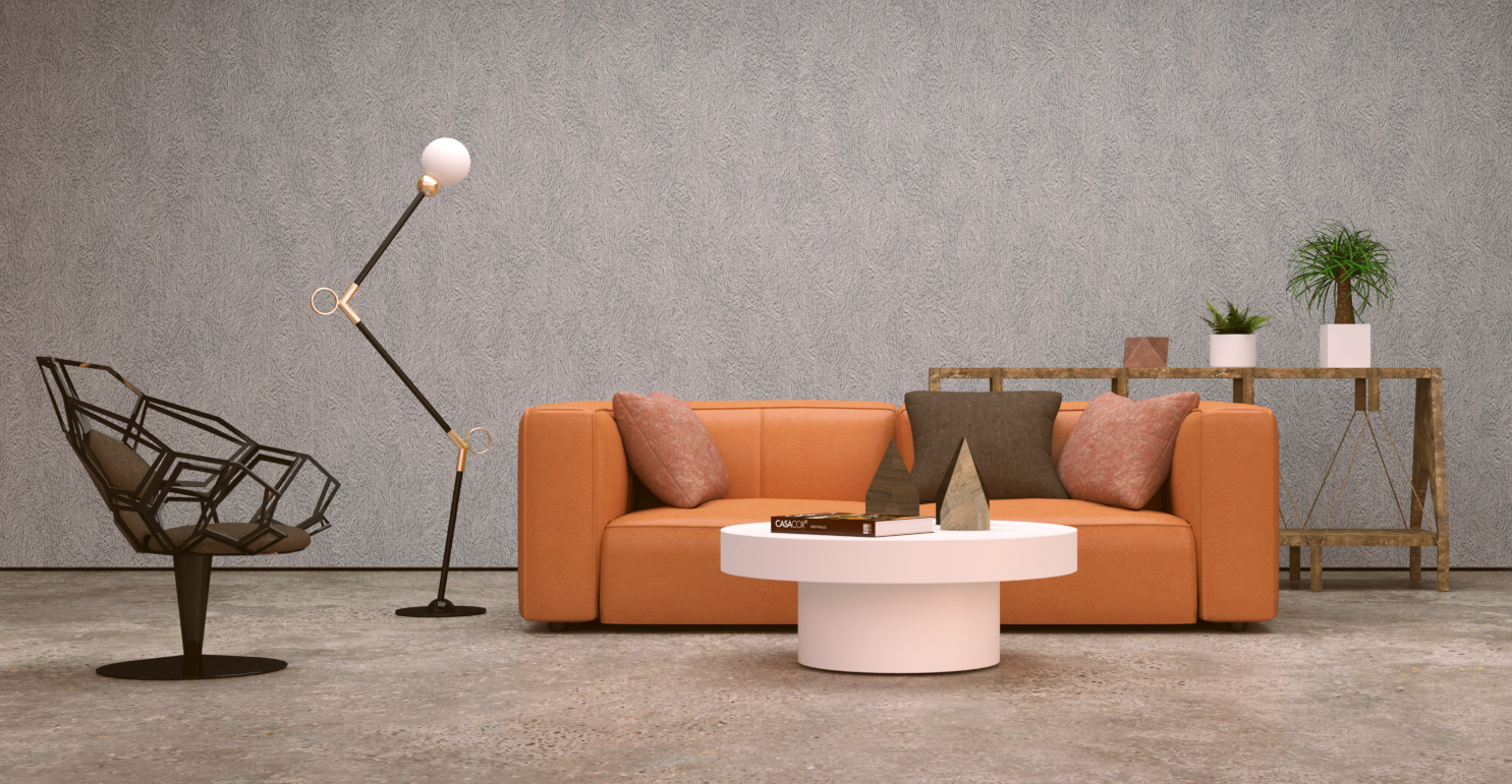
Podium Browser "living room assembly 02" rendered with ProWalker GPU
By all appearances, the render is very simple; just some furniture, a wall, and a ground plane. However, if we take the time to construct our scene in a way that mimics a real-world photography studio, we obtain finer control over our result and end up with a versatile studio rig that can be adapted and re-used in future projects.
Purpose and Examples:
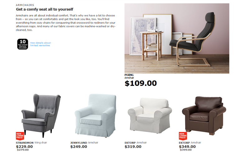
Example of an editorial lead on the Ikea website.
The goal in this type of image is slightly different from a product or design photograph in which the subject is often isolated against a white "infinity" background.
In an editorial style shoot, there is generally a touch more context—a wall and floor, a window, or a few props to indicate how and where the product will be used in the real world.
Most publications will use some combination of the two styles—IKEA's website uses an editorial lead to anchor each section and then subsequent rows of product photographs (pictured right).
Style reference and target photographs:
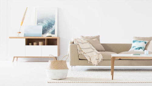
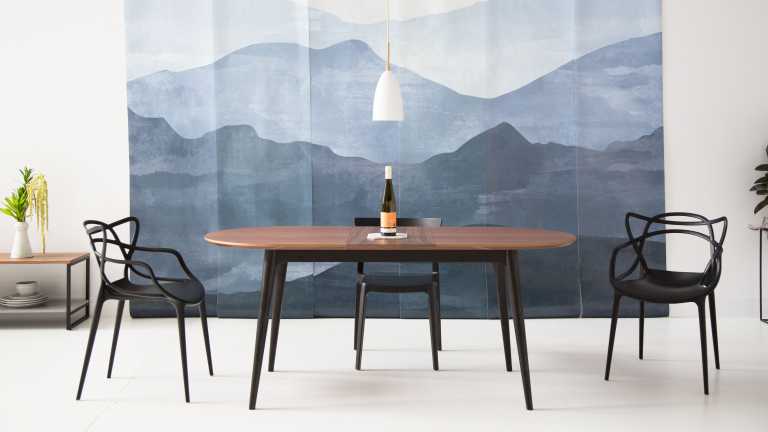
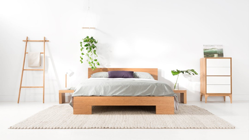
These photographs from the Rove Concepts inspiration book will serve as a style key for the second image we'll create in the tutorial.
If you Google something like "interior photography studio," you'll find hundreds of examples that show the myriad ways a studio shoot can be arranged.
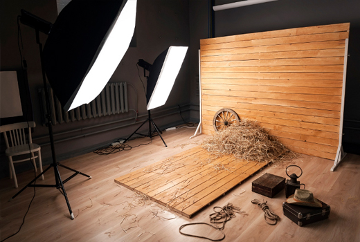
Smaller-scale set with directional softbox lighting.
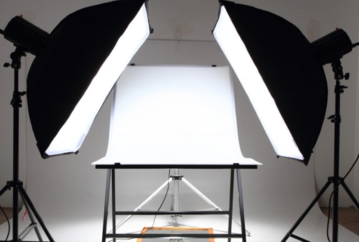
Product lighting often uses high-key two or three point softbox lighting to elminate any directional shadows.
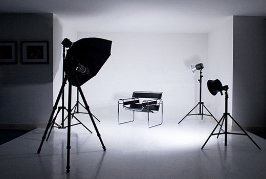
Isolated subject placed in an alcove for even distribution of bounced light.
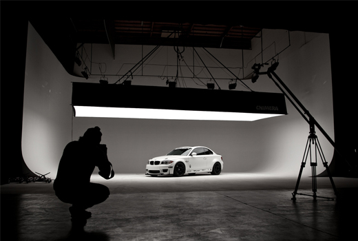
Low-key automotive layout with strong overhead lighting and smooth wall/floor transition.
Although there is variation depending on the subject, the same basic features appear through most of the studio types. Once you have a few common pieces modeled they can easily be shuffeled around and re-configured to suit your needs. Here's the studio we used for the image at the top of the page, essentially a larger-scale version of the far left example with the addition of an overhead softbox.
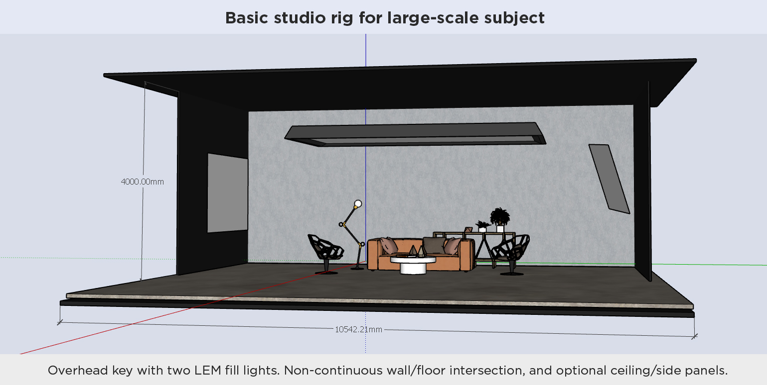
Generic studio rig for a large-scale subject.
Should the space be enclosed? This is a decision that needs to be made on an image-by-image basis. The sky acts as an ambient light source, which can be can be problematic for real-world photographers trying to produce carefully controlled lighting. But in SketchUp we have full control over the sky and can use it to suit our needs. ProWalker GPU has an additional advantage here, as we are able to use any HDRI image in place of a sky simulation, allowing users to introduce subtle, true-to-life tonality and color variation.
Tip: As mentioned above, the sky can be "turned off" in ProWalker by using a flat black HDRI file as the background. A similar effect could be achieved in Podium by using the "Default" environment setting, and setting the SketchUp background to black.
2. High-key with soft directional light:
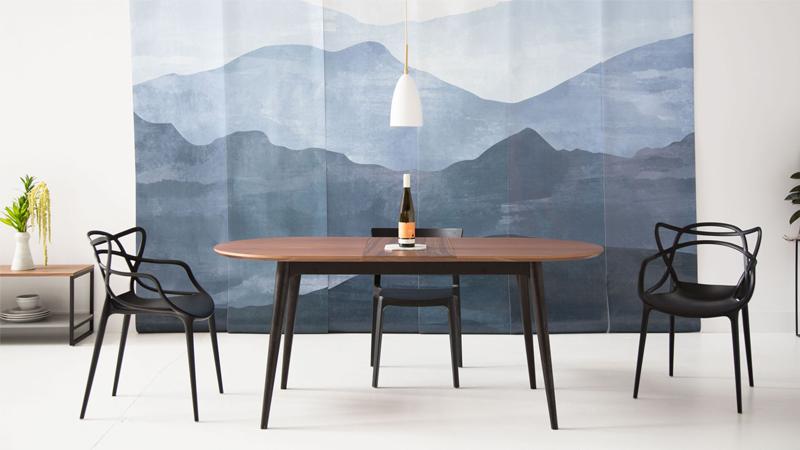
We need to make some changes if we want to emulate the cleaner, high-key style seen in the Rove Concept references. These photographs have less contrast, and cast shadows coming from the left are not particularly sharp, which means the light source is probably large and diffuse. There are at least two ways we could approach this:
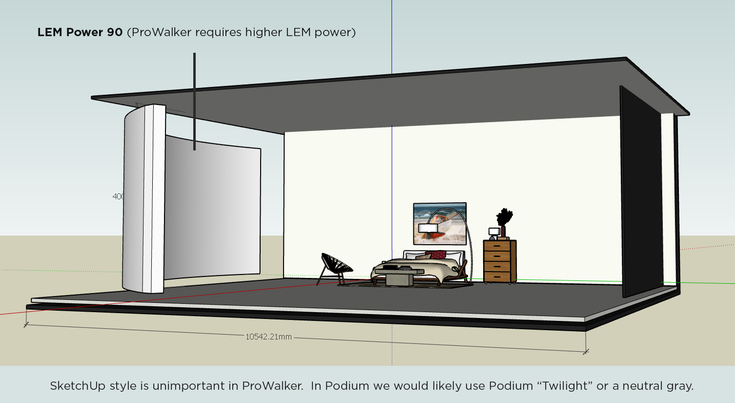
I've opted to remove the LEM fill light on the right side of the studio, as well as the overhead. Additionally, I've changed the color of the wall and ceiling panels to white to get brighter bounce light into the scene.
Here is the revised studio with a large curved LEM to cast a soft left-to-right shadow into into the scene.
And here is the image it produced: This was rendered in ProWalker GPU using Photoreal mode, at 10,000 samples. In addition to the LEM light, we are using an HDRI background to contribute subtle tonal gradation to the render
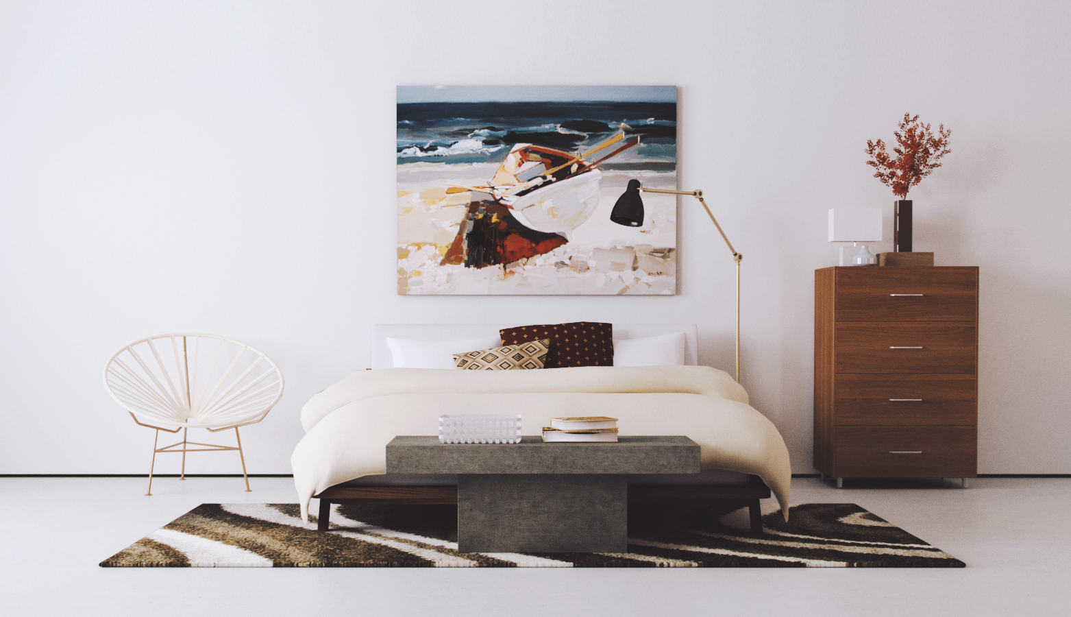
Curved LEM casts soft directional light, and HDRI image contributes subtle rose color. Podium Browser Bedroom Assembly 15 rendered with ProWalker, PR Mode, 10,000 samples,
3. Low-key lighting with dramatic contrast and invisible horizon
Another common studio technique is to isolate a well lit subject against a darker background. This image style is prevalent in automotive imagery and relatively common in furniture and fine art (ie. sculptural) photography.
Here is a Mini Cooper model from Podium Browser rendered in ProWalker:
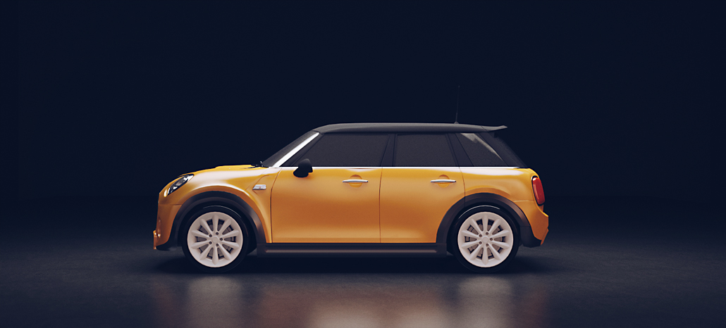
A single overhead light illuminates the subject and ground while letting the background fall into darkness.
How it's made:
Automotive studio images are almost always lit by a large overhead softbox or reflector. In this example, we let the illumination fall-off gradually and pushed the back-panel far enough into the background that the horizon is obscured in darkness.
Subtle illumination could also be cast onto a curved backdrop if a more stylized look is desired.
Render details:
We have once again rearranged up our studio model produce a low-key, high contrast image. This is probably the simplest configuration yet, with only a single artificial light source.
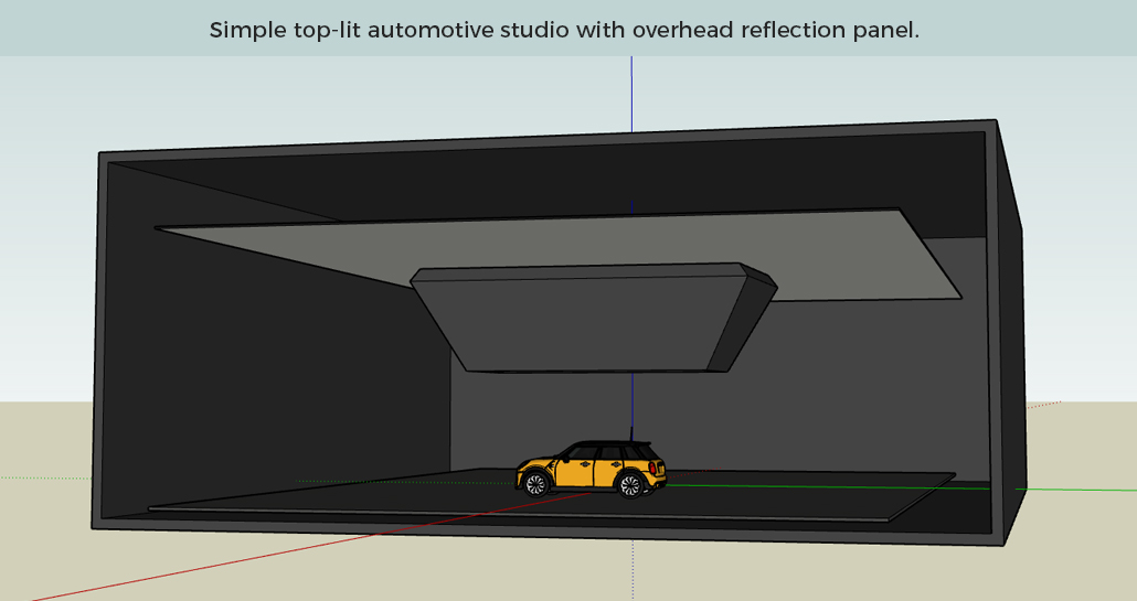
Vehicle is lit by an overhead LEM inset into a softbox to shape and focus the light falloff.
The studio model:
As you can see, the entire studio is recessed into a dark colored enclosure with the front face left open—the reasoning for this is two-fold:
We want our HDRI background to cast subtle illumination onto the subject, but we don't want to see the background image in the shot.
Placing the studio into a deep rectangular box lets the vehicle recieve light from behind the camera, but ensures that the illumination falls to black by the time it reaches the rear wall. Rendering without the enclosure produces a very different type of image—not necessarily worse, just not really what we're going for in this project.
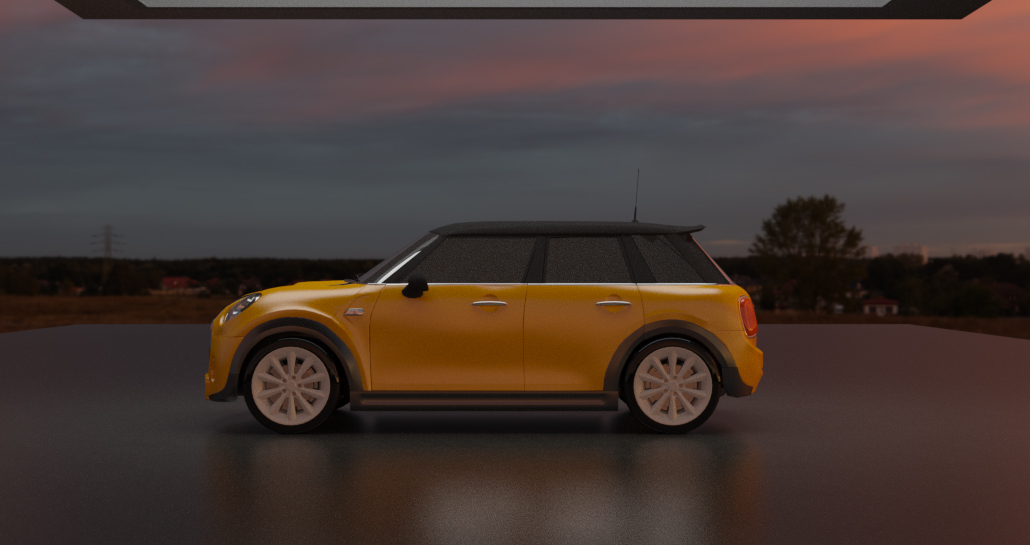
The LEM soft-box:
For this image I wanted light from the LEM to illuminate the vehicle and a small portion of the ground plane, but leave the walls and back-panel in darkness. The geometry around the overhead LEM is just an arbitrary shape used to focus the light into a narrow beam—structures or panels meant to block or redirect light are referred to as "flags" in studio photography.

Note: The extremely high LEM Power is necessary in ProWalker, but would be far too bright in Podium. An equivalent strength in Podium would probably be somewhere between 20 and 30.
The reflection panel directly above the LEM softbox emits none of its own light, but brightens the image slightly by bouncing indirect light back into the scene.
If you want a copy of this model, please download it here.
5. Conclusion and wrap-up:
There are countless ways a studio scene can be arranged, and a wide range of image styles that can be produced simply by changing the position of a few lights, using a different background style, or introducing different props and reflectors.
We strongly recommend studying real-world approaches to studio photograpy and then trying to emulate it as closely as possible in SketchUp and Podium/ProWalker. We only covered three examples here, but plan adding at least two more image types in the near future. If you have any questions or want feedback, feel free to post your images in the forum!