Intro
Hello fellow renderers, this next installment in the tutorial series will focus on an interior scene Chris let us work with. If you did not have the chance to have a look at the first tutorial, we worked on an exterior scene — you can catch up here.
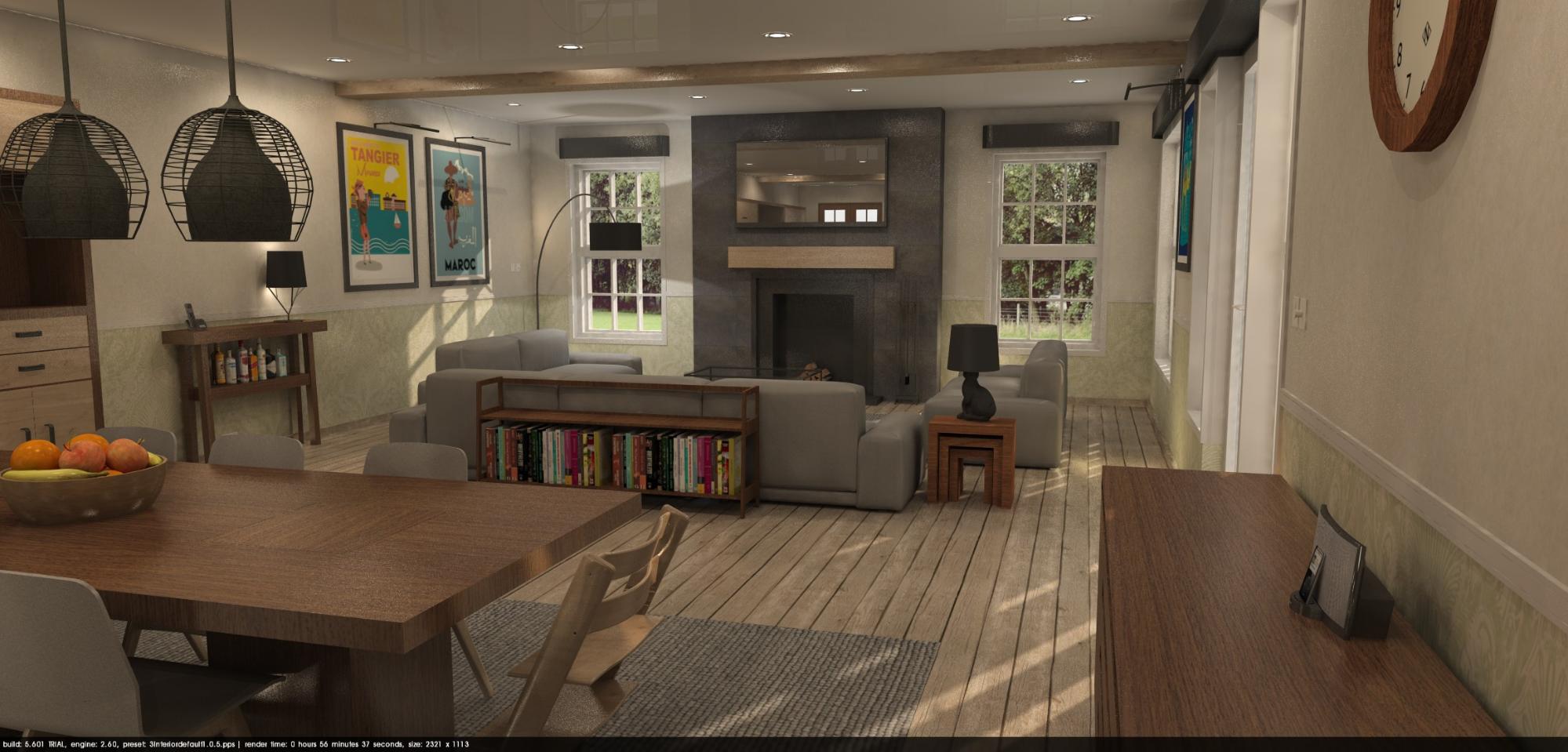
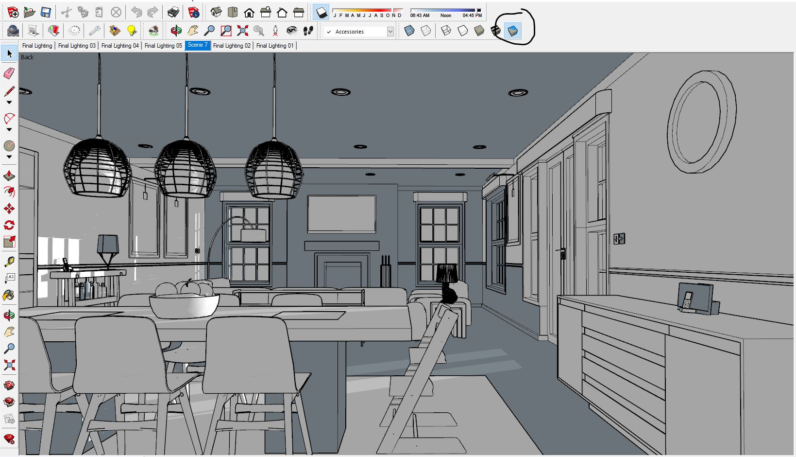
Chris' starting image, straight out of Podium.
This is the original view that Chris rendered before sending us the model. As you can see, it is a well furnished scene with lots of details to work with. He already put a background image outside that works well and populated the model with several items. With some slight changes to materials, lighting, and composition, we can easily pull a very nice image out of this scene.
Before choosing a new point of view and framing, I wanted to make some corrections on the lighting to better understand how we could feature the scene. The first thing we'll do is kill the artificial lights for two reasons:
Realism - Renders with both the sun shining and loads of artificial lights result in an evenly lit space, but it is not realistic for a residential interior; you don’t usually turn on the lights in your house when there’s sufficient natural lighting around. In design terms, it completely kills the dynamic of the scene and negates the impressive effect of natural lighting. You need both bright and dark areas in your renders if you want impressive images that strike the imagination of your clients.
Render time - The more lights, the longer the render time. A few won’t be a cumberstone, but at some point it will help you with your tests if you limit the number of light sources. We saved approximately a minute of render time here on total of 10.
Compensate with the intensity/exposure sliders - After turning off all the spotlights I set the sun intensity and exposure to the max, and used the interior bright preset since we don’t have that many windows and need to make the most of the natural light. I also played a bit with the time of the day in SketchUp to have more sun coming in and a nice early morning glow effect.
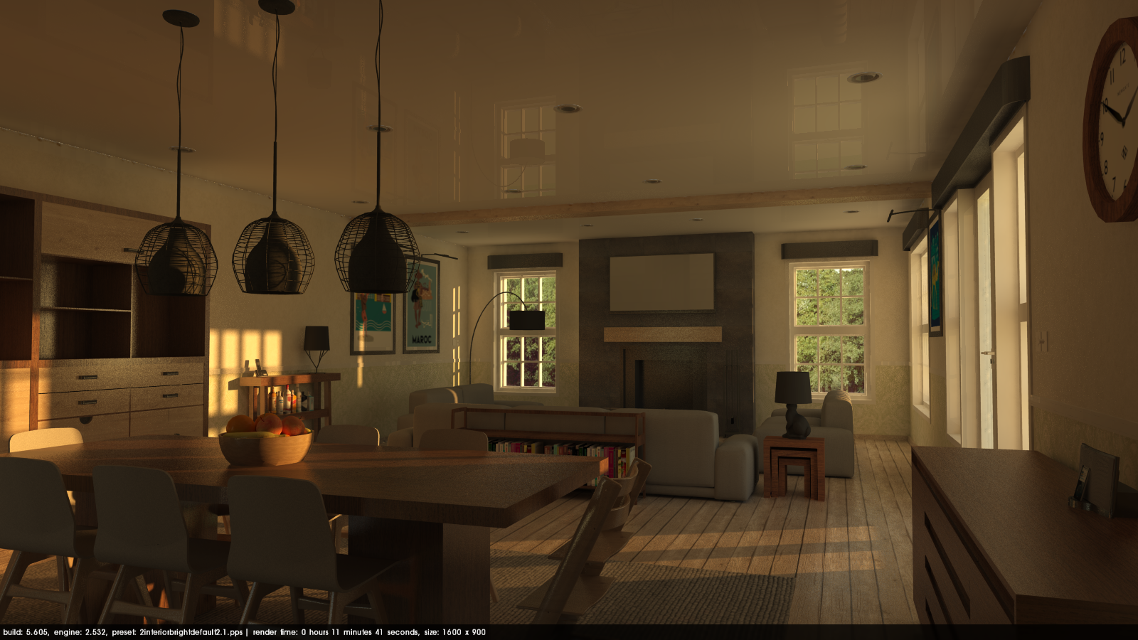
The same view rendered without any artificial lights. Intensity/Exposure set to max with Interior Bright preset.
You can notice how the early morning sun is warming up the space in a really interesting way. It brings a whole new feel to the image, something that we will enhance with post processing at the end. We will make it brighter later on.
TIP: You can turn on and off all point lights at once using the Podium tools. (Extensions > SU Podium V2.5 Plus > Tools > Toggle point lights).
Our lighting is not final yet, but rendering is an iterative process. I personally work in iterative circles; work one aspect until I am fairly happy with it, then go to the next, come back later, fine tune, go to the next and so on until my patience or time runs out.
Field of view
Having the right field of view is crucial in interior renders. This setting will change how wide your camera will see. By default SketchUp’s FoV is at 35 degrees which is great for exterior renders. Just like photography, choosing the right lens will greatly impact the ability of your image to correctly show the room you're in.
You can easily widen the FoV to 45 degrees for almost all interior renders. In really small rooms going up to 55 will help. The higher the number, the more distorted the view will look. If you are used to working with 35 degrees, changing to 45 might be shocking at first but you do get used to it.
I used 45 degrees for this scene.
Tip - To change the FoV select the zoom tool in sketchUp and type in the number you want. You will see the value where you normally see measurement in the bottom-right of the SketchUp window.
View alignment/composition
Having the right point of view can be tricky, it's a trial and error process that varies from scene to scene. With experience you will find that some subjects and composition styles are more photogenic than others. You will naturally choose a point a view that will both make your image and your subject look good. In some cases you will make lots of tries, and never be fully satisfied without knowing why - it’s just the way it is, but practice and experience will help you intuitively choose the best composition for your subject.
Look straight:
One trick is to place the view parallel and/or perpendicular to a strong element in the project. If you look at good photography or some great cinematic scene notice how the camera moves along a straight line or how it tracks perpendicular to a big facade. Try to go away from angled views when possible.
Here, I lined up the horizontal lines like the table the and wood beam so that it is parallel to the top and bottom of my screen.
Tip - To quickly reset your camera to a neutral position, use the "Reset Tilt" function in the Podium tools menu. This is a good way to restore your vertical alignment (tilt) without altering the camera's horizontal alignment (rotation).
(Extensions > SU Podium V2.5 Plus > Tools > Reset Tilt).
Dont' look down
Don’t make your point of view too high. Having a high point of view will force you to look down making the space look smaller. Notice how the center of the view faces the wall on the back; a line from the center of the camera to the wall would be perpendicular to the wall - or along the normal of the surface you are facing if you are technically picky. Unless you have a good reason to do otherwise, set your camera at or near eye height.
Here’s our new point of view:
Now that we have a fixed point of view and lighting design to work from, we can moeve on to the more technical aspects. Materials can be easily fixed and will give a notch more realism. I tried to use as much of what we originally had as I could. We could find a better looking texture that would make a better render, like the wood for instance, but it would denature Chris's work.
We will look at other more problematic aspects:
Ceiling
You could hardly have such a big perfect reflective surface like this. In reality if you’d want such an effect, you would probably use lacquered stratified panels. You would need to model the gaps between each panel to make it look convincing.
If you aim for a classic drywall finish, either for wall or ceiling there is no need to add reflection to your texture. Sure, wall paint can be slightly reflective, but in a rendering context the difference would be too subtle and will probably introduce more reflective grain than necessary.
Floor
The floor texture does not look that bad by itself, but it is not an interior wood floor texture. Although at a distance it gives a nice rustic look, we can see the gaps between the planks and the wood defects in the center of the room. We’ll pick a nice texture from the Browser and make sure there’s not too much reflectivity to keep the rustic look.
I also changed a few textures along the way like the stone on the fire place and set its inside material with 2% blurred reflection. Also changed the wood texture of the bowl (texture mapping on a curved surface can be a pain). Set some reflection on the liquor bottles etc.
The updated image after changing floor and ceiling materials.
Inverted faces
SketchUp Face orientation is often overlooked by users. When you start modeling, Sketchup will display the front side of the face in white and the backside in blue using the default material. If you start painting those faces with other materials, you will overwrite the default material and the only way to see the orientation of the faces is by using the monochrome view mode.
Switching to monchrome face mode reveals that the model contains a large number of inverted faces (blue), which can be very problematic for rendering.
Inverted faces can cause issues in a lot of rendering software, and Podium is no exception. If you changed the scale or position of a texture that is mapped on the blue side, it may appear differently in your renders and you may end up with what appears as a "light leak" along the edges.
The solution is simple: always paint the front faces, and reverse inverted faces and re-apply textures when necessary (select face, right click, reverse faces). Check your model periodically for inverted facee using the monochrome view mode.
If you go back to the original render, you will notice there is a white line separating the ceiling from the walls. This was caused by the orientation of the ceiling face.
Object modeling
A good model is the foundation of a good render. We talked about how PP can take you render to the next level in the last tutorial, but putting icing on a bad cake, still makes a bad (if prettier) cake. Good detailed modeling is particularly important for objects in the foreground. But be careful, adding too much detail on something you would never see is not better; it will only make your render and model navigation slower.
If you look more closely at the original image, you can see how the clock on the wall has jagged edges because of the lack of circle segments. The cabinet under the clock looks fairly ok, but it needs more details around the gaps and edges. Same for the table, which looks too monolithic and unrealistic as is. The suspended lamps are also a bit too crude and unrealistic.
Cabinet
Using plugins like Round Corners will help you work the edges and give a subtle, but much needed realistic touch. Edges on objects are rarely completely sharp, and the small specular highlight a round edge gives is most welcome. Be careful, in most cases three faces for a round edge will be well enough. Even a one face bevel makes a difference at a distance, at virtually no render time cost.
When modeling wood parts, make sure the grain of the wood is along the long side of the board. It may look very unrealistic otherwise, especially with short or long boards.
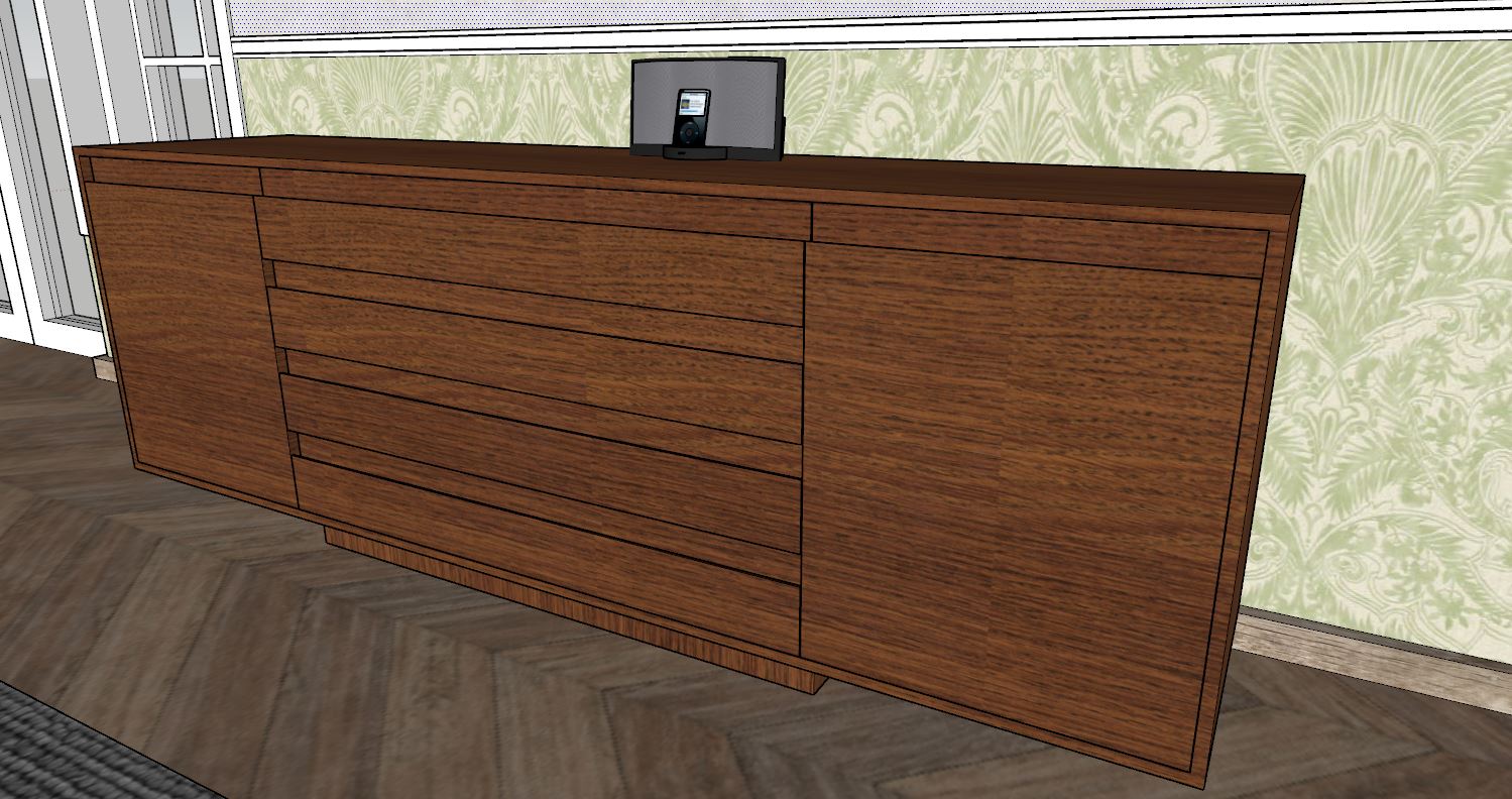
Before modifications.
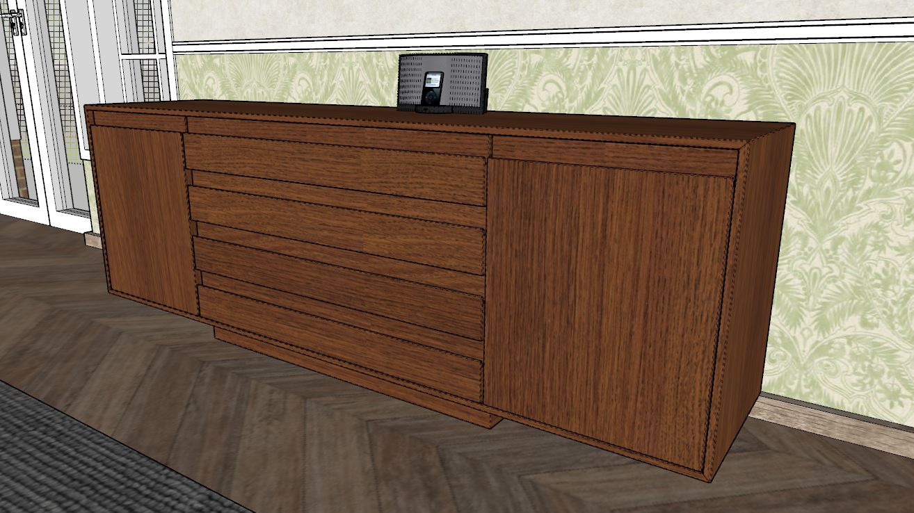
After modifications.
Changes may look very subtle in sketchUp but it makes a difference when rendered. Notice how the separate parts have bigger gaps between them and their corners are a bit rounded. The orientation of the texture on the edge of the side board is now vertical and comes at 45 degrees with the horizontal edges.
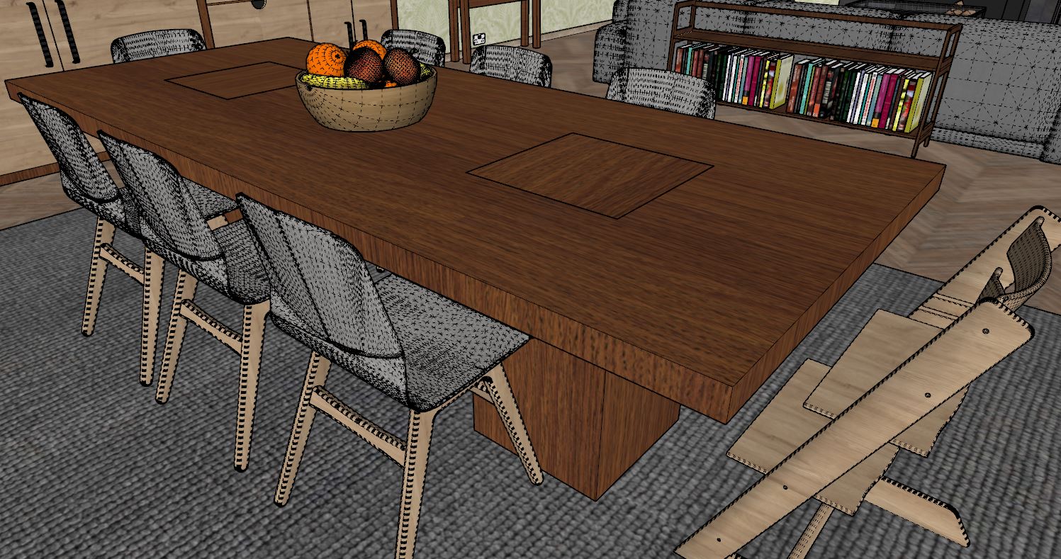
Dining table
I made similar changes to the dining table. Divided the main surface in 3 parts to give some definition, rounded all corners and fixed the wood texture orientation. Also modeled some quick lighter legs that hovers 5 mm from the carpet to enhance the shadow gap and suggest there’s some plastic pads under.
Before modifications.
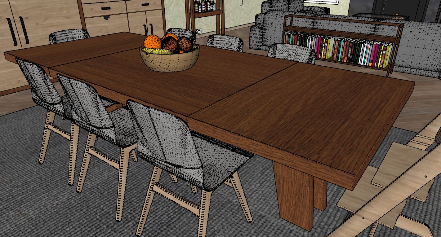
Table after modifications.
After correcting these I replaced a few item in the model from the Browser: TV, Clock, Lamps, and dining chairs.
Along the way and after a few renders, I played a bit with the sun orientation again. I figured out the scene would benefit more from a more direct, powerful sun than having yellowish morning glow.
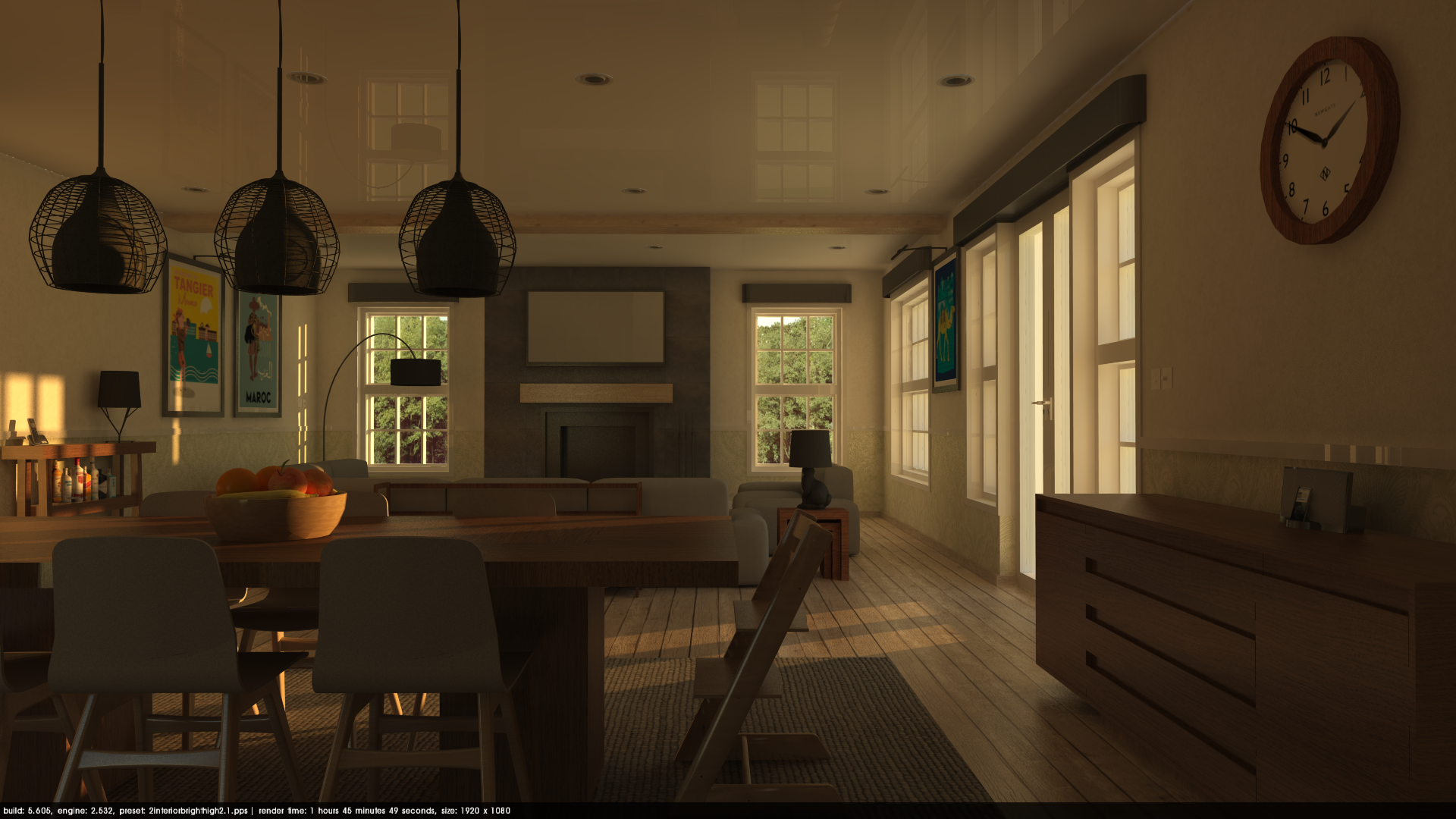
Here’s the raw render using the Interior Bright High preset at 6000 X 3000. I like to use this resolution for my final interior renders. It can take some time to render, but rendering almost 3 times the size will help reduce the grain of the reflective surfaces when the image is smaller.
Tip - Rendering larger than you need might sound superfluous, but several processes in Podium are in fact resolution-dependent. The most noticeable of these are "blurred reflection" and "anti-aliasing" or edge smoothing, which will both look much cleaner if you render at 2x (or greater) resolution and then scale down.
Of course rendering at a lower (normal) resolution is completely fine if you don’t want to render over night, or don't have time.
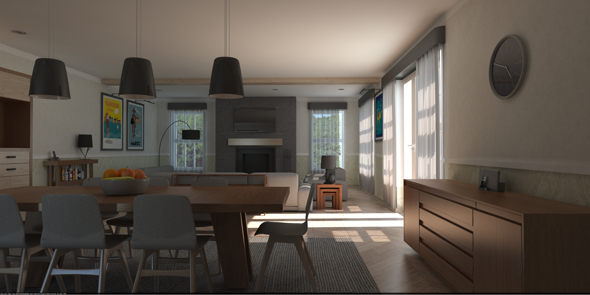
The raw render with revised lighting, just before post-processing.
Post processing will help us fine tune our lightning and framing. We don’t have a lot room to work in but the subtle changes can make the difference.
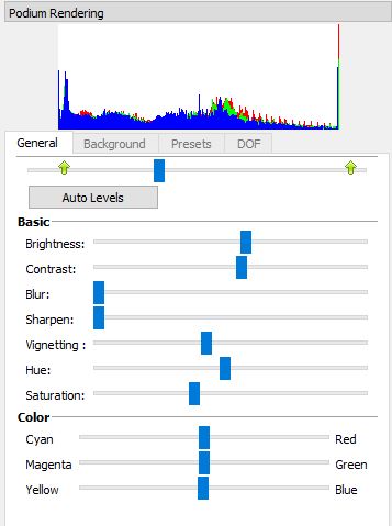
Here’s the settings I used to make overall scene brighter with more contrast:
Levels: Moving the center square nod of the level tools to the left makes the image brighter but lowers the contrast. You can correct that by moving the left green arrow to the right and using the contrast slider, naturally.
Color correction: I changed slightly the hue to a tiny bit more red and lowered the saturation.
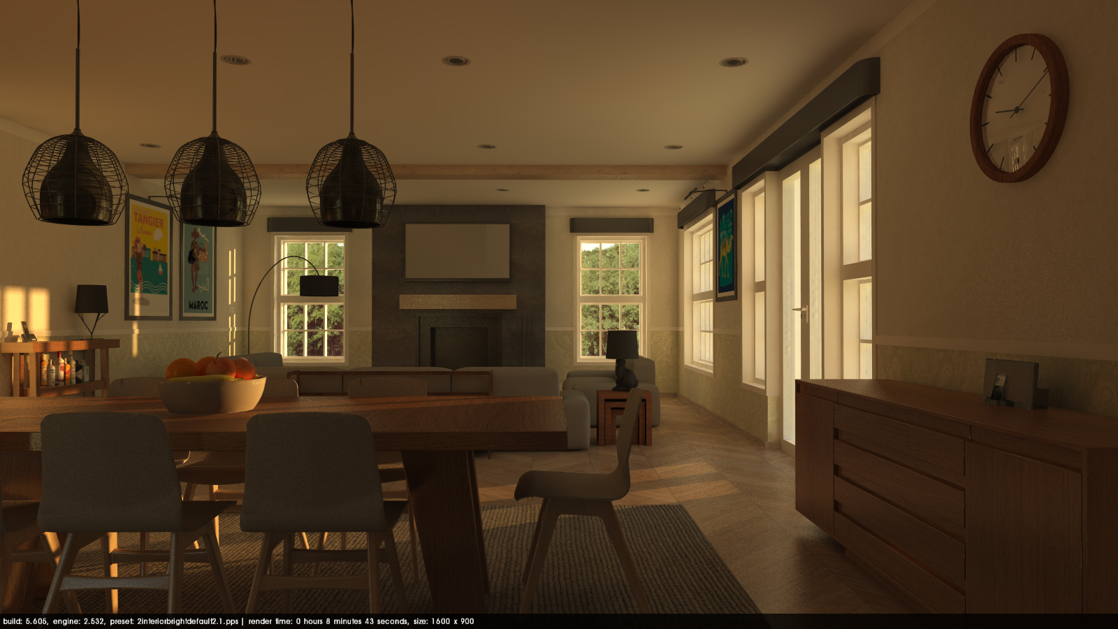
Final step is to use the crop tool to reframe the image and add a small depth of field (DOF tab) effect and Voila!
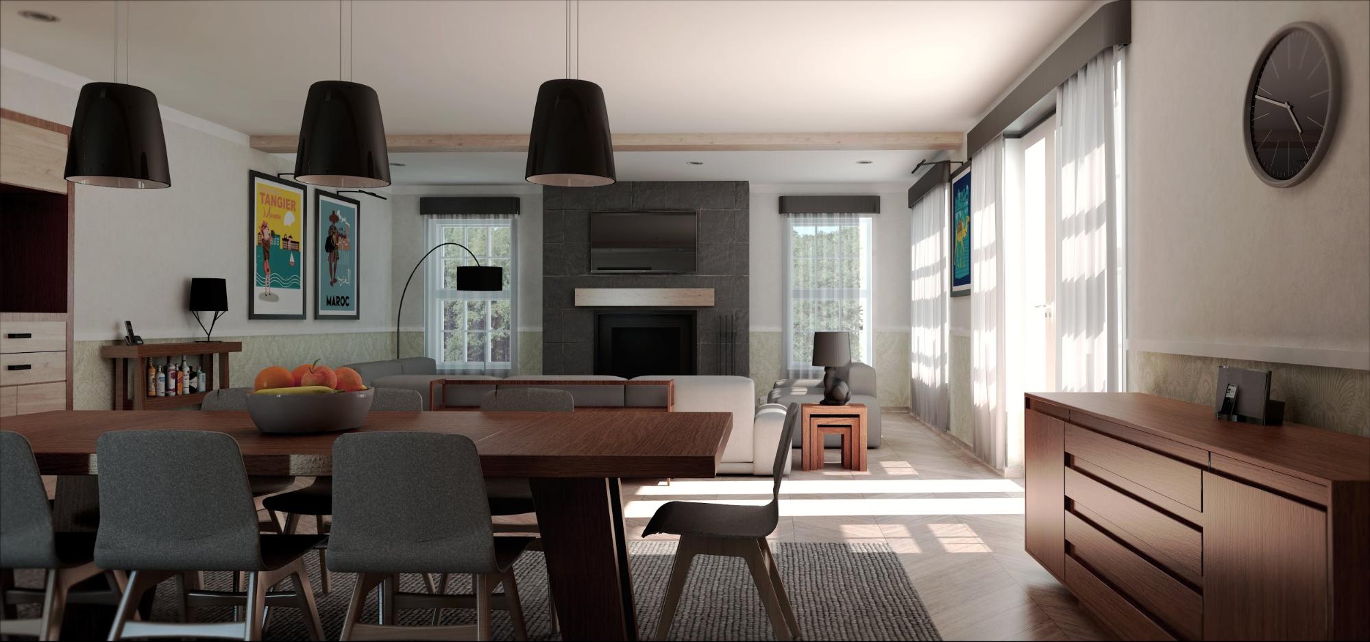
The final image after post processing
Get in touch!
We hope you enjoyed reading the tutorial and learned a technique or two that you can apply to your own images. If you have any questions, suggestions, or think you might like to volunteer one of your images for the tutorial series, please don't hesitate to get in touch!
You can always reach a Podium team member on the forums, and there is a stickied thread here where you can submit images if you have a render you aren't satisifed with and need help improving. Our goal is to publish before/after tutorials on a regular basis.
Additionally, if you have a specific question for Nick about this tutorial, feel free to contact him via email. Thanks for reading!